Turning Daily
Driving Hassles
into Seamless Journeys
Perosnal Project
Mobile App
1 month
UX Research and Design
Background
Tired of Rearranging Stops
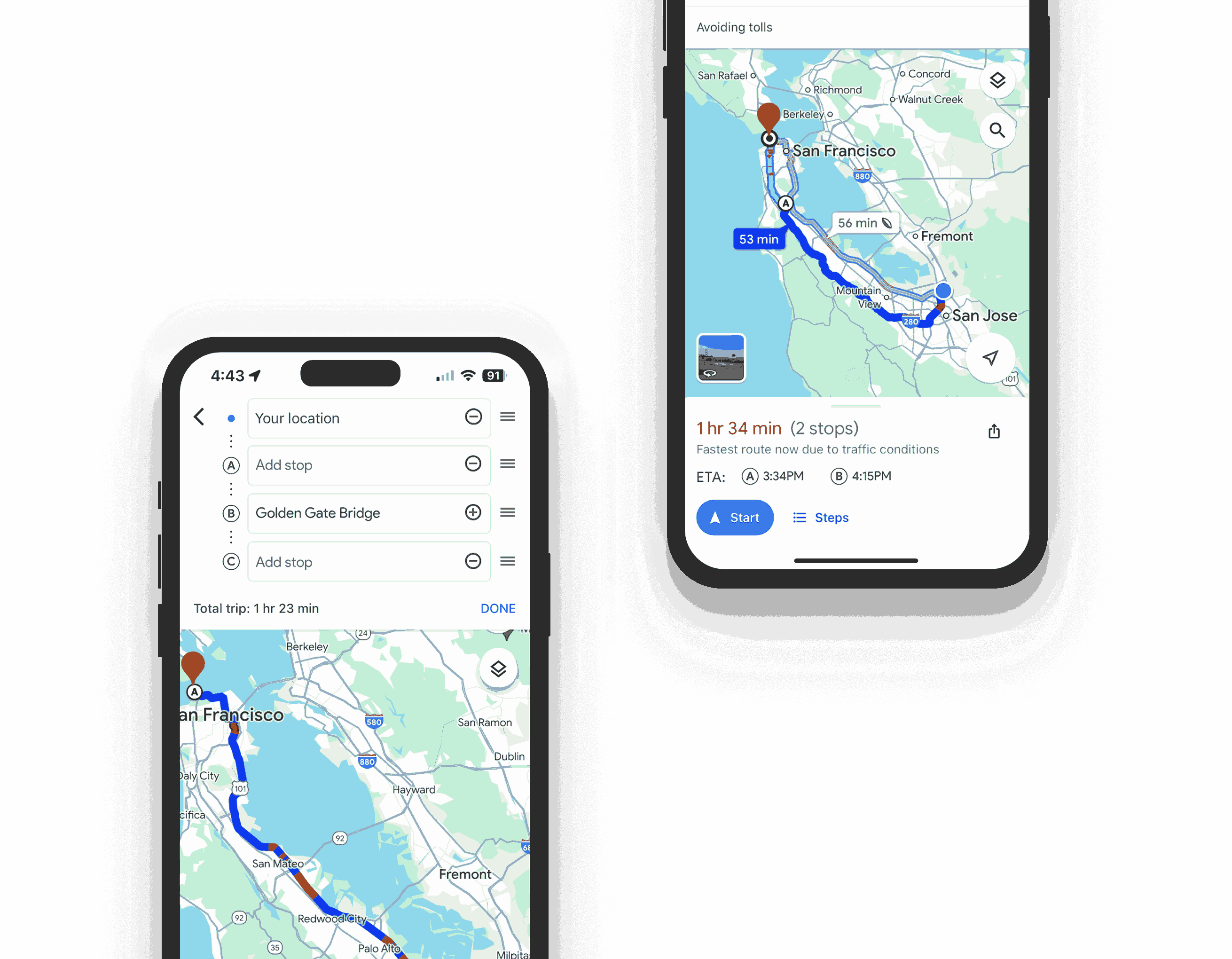
As a frequent driver who relies on Google Maps for navigation, I often utilize the 'add stop' feature whenever I have multiple destinations. My usual approach involves setting the final destination first, followed by adding any intermediate stops. However, I’ve consistently found it inconvenient that Google Maps requires stops to be added in order, which forces me to manually rearrange the stops every time.
This repeated friction sparked the idea for this project, where I set out to redesign the 'add stop' feature to enhance usability and streamline the process.
Research Goals
Navigating User Pain Points
The research aimed to uncover challenges in adding and rearranging stops in Google Maps, discover user preferences for stop sequencing, and identify any other related pain points to enhance navigation efficiency and satisfaction.
Methodologies: 1. Competitive Analysis 2. User Interviews

Competitive Analysis
Different UX in adding stop feature
First, I compared the add stop feature across three apps, and it was clear that Google Maps had the most steps for adding a stop.
Google Maps
Meatballs menu button
Add stop
Stop added as a next stop
Apple Maps
Add stop button
Stop added as a next stop
NAVER Map
+ Button
Stop added as a
intermediate stop
Competitive Analysis 2
Comparison of ETA Display
This table outlines how the three maps display estimated time of arrival (ETA) for the final destination and intermediate stops before and after starting navigation.

Affinity Map
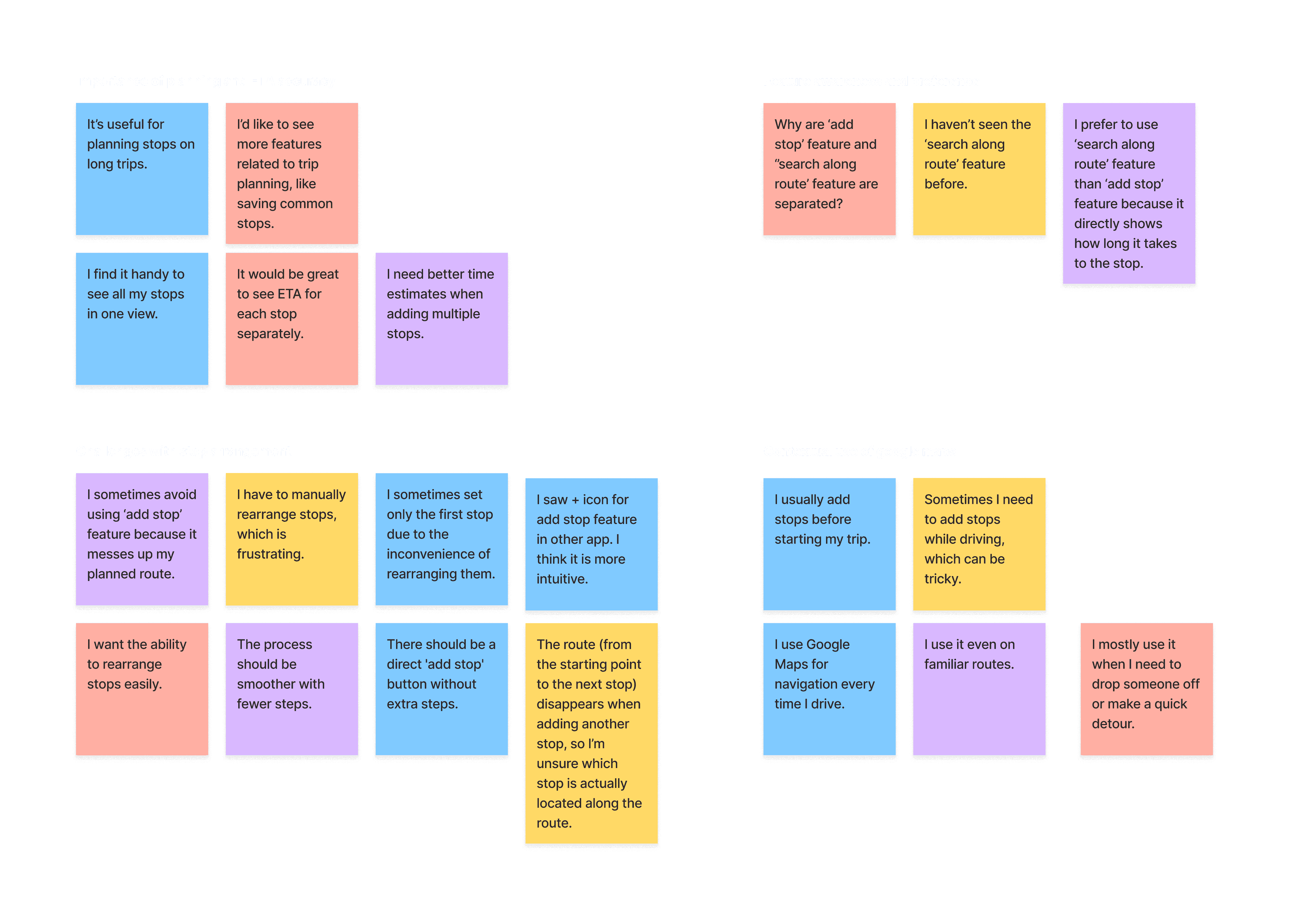
Four people were interviewed and they provided some new perspectives
Resarch Findings

Users preferred a quicker, less complicated process for adding stops.

Users generally viewed the 'Add Stop' feature as a means to include intermediate stops on their route rather than as a tool for setting sequential destinations.

Users valued having ETA information for at least the first stop when adding multiple stops, as it significantly influenced their decision-making process.

Users were often confused by the separation of "Add Stop" and "Search Along Route." They expressed that the purposes of these features overlap, as both are used to find and add stops along their route.
Personas


Solution
Discovering a better system for Add Stop
To avoid causing confusion in the current user experience, I focused on finding ways to enhance the system while maintaining most of the existing features.
01
Simplified Stop Management
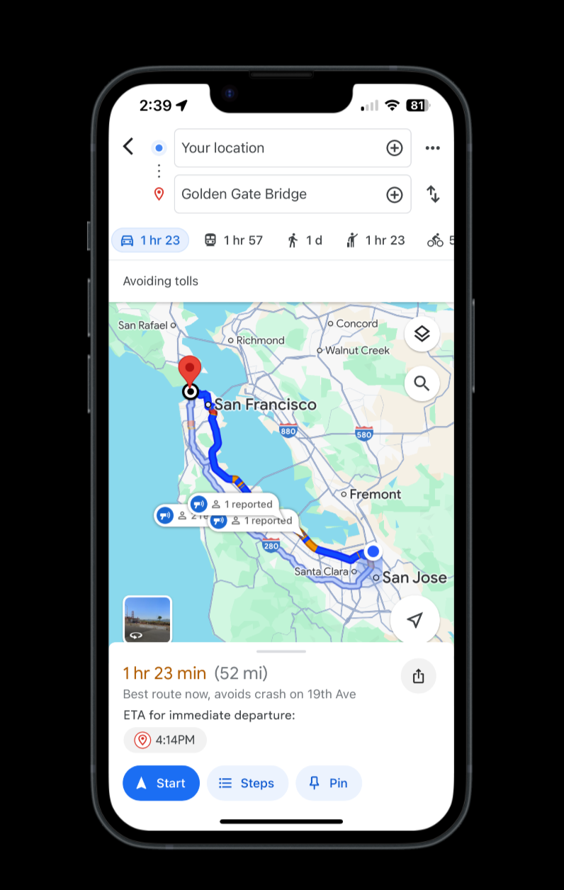
+ and - buttons simplify navigation and allow direct stop additions, ensuring that the next stop is added in sequence, consistent with the current Google Maps system.
02
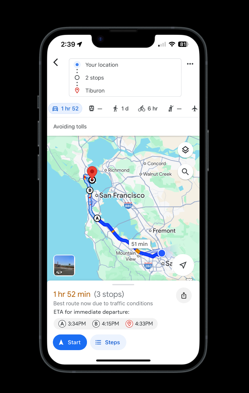
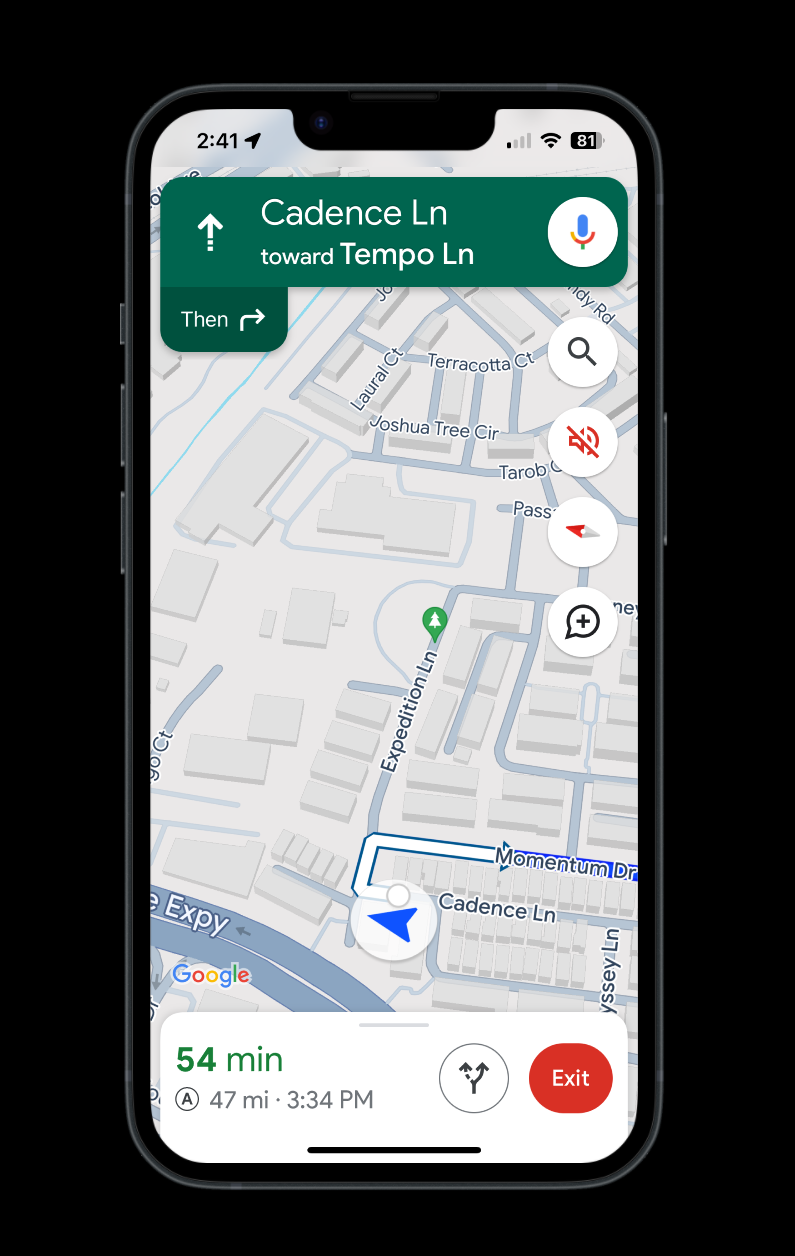
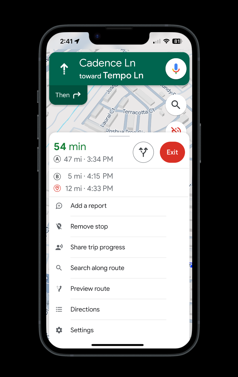
Dynamic ETA Display
Before starting the trip, all stops' ETAs are displayed with the label "ETA for immediate departure" to indicate potential inaccuracies. Once the trip begins, the main screen shows only the next stop's ETA, and users can swipe up to view the ETAs for the remaining stops.
03
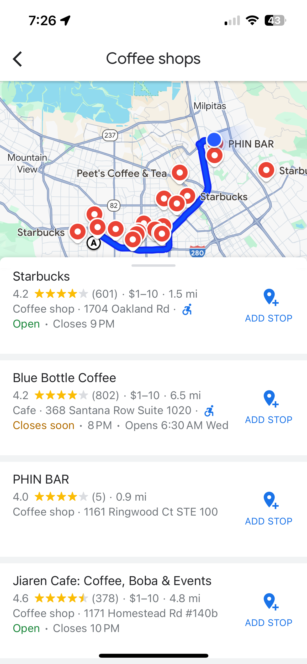
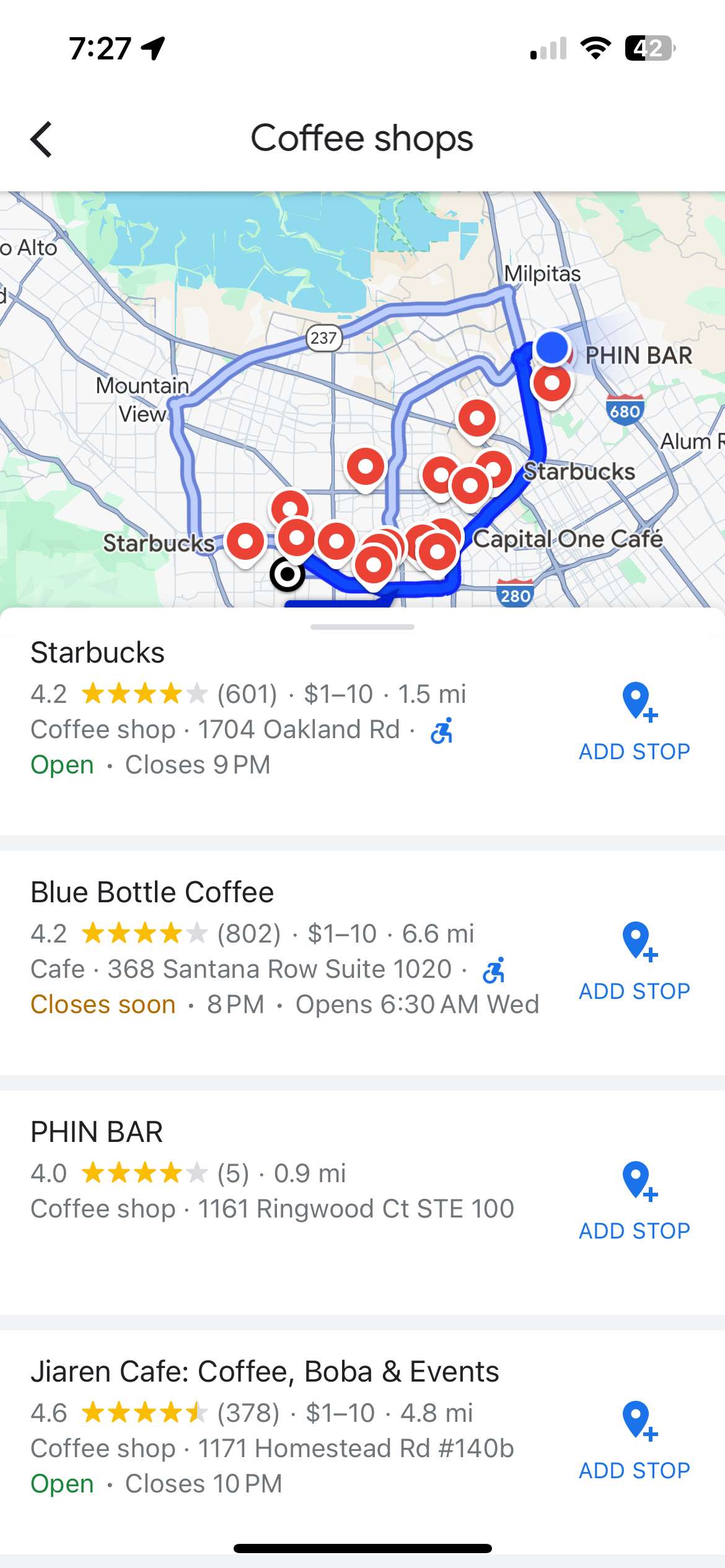
Merging "Add Stop" and "Search Along Route" Features
Based on the user interview, a more intuitive approach would be to merge these functionalities. By allowing users to add stops and search along their route within a single interface, we can streamline the experience. The sequence in which users add stops could determine whether the system prioritizes route-based suggestions or specific destinations, making the tool more flexible and user-centric. Further research from a software development perspective would be beneficial, but the initial findings suggest that integrating these features could significantly enhance user satisfaction.
Add Stops
Search Along Route
Prototype
Key Takeaways
